A hub for partners to gain data and tools on their apps in the marketplace that they created with PowerApps and Dynamics 365. I worked as the principal designer in an agile, sprint-based product cycle.
Background
Microsoft Power Apps is all about democratizing the power of development;
taking the usually high barrier of app development and lowering the bar to entry with powerful tool sets. This allows less technical roles such as data analysts, sales specialists, and administrative assistants to utilize existing data to create powerful apps for their use cases, without needing a background in engineering! This works best in products with other work best together in tandem; you could create an app in PowerApps that automates the process for refund requests directly in Dynamics 365!
The success of this model has been evident, and it has lead to a natural evolution of people creating apps that they realize solves problems not only for them and their clients, but for the industry as a whole. This leads to them wanting to manage and sell this app as a repeatable service. This is something that Microsoft wants to support; it increases the capabilities and market position of their own products to have these apps and connectors available, and a sale of that capability to a net new customer is a sale for Microsoft.
However, there are challenges in managing this relationship. These "partner" companies, as they are called, have a lot of needs for putting their apps on the market; they struggle with being able to understand the performance of their apps, and have a number of pain points around diagnosing technical bugs and making it through the process of certification.
Microsoft put together a plan to provide a data intelligence studio for these partners. This would provide them up to date info on time sensitive data and give them tools to make certifying new apps easier. This is where I came in; I was brought onto my role at Microsoft to collaborate with the development team, determine strategy, and own the design of this new product.
The product, called ISV Studio, takes place at the intersection between two powerful Microsoft products:
Power Apps
and
Power BI
The Team
Project Manager
Engineering Manager
UX Designer
Engineers x5
User Researcher
My Role
UX Designer
Intake requirements and own the discovery phase of each new feature.
Synthesize customer feedback and pain points into actionable scenarios and user flows.
Rapidly iterate on design concepts with minimal initial direction, and present findings to both design and engineering for validation.
Deliver high fidelity designs at key milestones based on sprint schedules, and include redlining and an engineering handoff.
Prototype the flow of each customer scenario, and own the navigation and IA for the whole product.
Collaborate directly with the engineers from discovery phase to well past shipping, and ensure quality with regular bug bashes and customer calls.
Customer Pain Points
Gathered from direct customer interviews and surveys.
Partners have no way to get quick insights on the health of their apps in the market, and if there are any critical issues that require attention.
Troubleshooting failures during the app install process is lengthy and painful, requiring a number of calls and putting the burden on the end user clients, causing the Partners to often lose business.
Lack of content strategy leads to no real consistent approach for how to show documentation and links in help surfaces.
Partners don't have a clean way to compare and contrast telemetry around their apps and connections. This info would allow them to make better development decisions.
The certification process for apps can be a bit messy, and requires quite a few steps across multiple disparate touchpoints. Partners could use a lower barrier to entry.
Getting your app on the marketplace requires a number of manual checks from a quality assurance team. The back and forth can take weeks.
The Design Process
To get a product of this type to get off the ground, we needed to get a feedback loop started with our core personas. We put the initial work in to get the bare neccessary features needed to launch an MVP (Minimum Viable Product) into a limited public preview. This gave us a chance to release in increments, and gain feedback from real customers on each incremental release.
2 Week per Sprint
4 Reviews per Sprint
6 Months between Releases
From there, we had dozens of features in the backlog needing to be prioritized. Each needed research and brainstorming to determine the design, which then need to be shared with relevant stakeholders in design, engineering, and business strategy to determine if it is viable. We handled this by setting up two week sprints; at the start of each sprint we would prioritize the most important things that had to be done, and would divvy up my working hours between each. I would usually have multiple features to work on per sprint, and many features would take multiple sprints of work. This helped us to forecast the time allotment early, determine when handoff to development will need to happen, and set up the intermediate review milestones between.
This was my high level process for any given feature:
Step 1: Start with the customer scenarios
It is critical to understand your customers' need for engaging with the feature. Setting out their work scenarios in a "Who, What, Why, How" format keeps us aligned on the core jobs to be done throughout the design process. It is also imperative to gather any interviews, research, and information you have on your audience; the more you can understand about their jobs the better.
Example Scenario
WHO
"I am an ISV at company X (Publisher X).
WHAT
I need to view data to determine how my app is being used,
WHY
so I can diagnose potential issues and determine how to sell or market my app to new customers.
HOW
The ability to view usage data filtered across my app and its components will help me achieve this."
Step 2: Get it out there
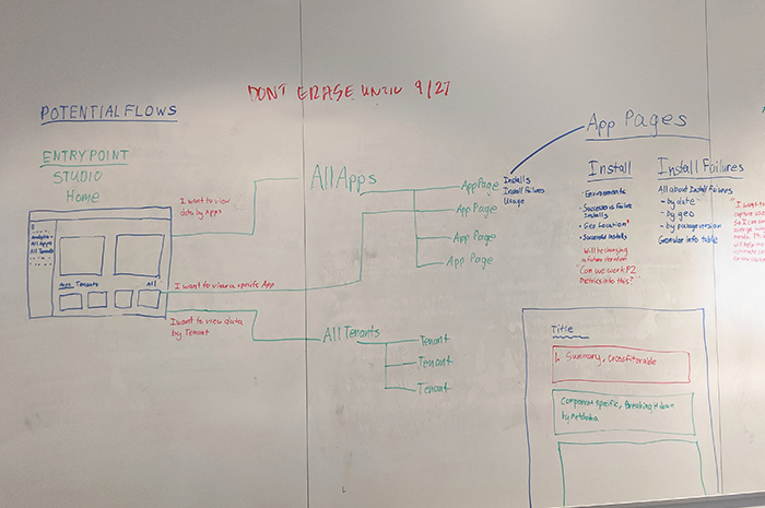
Once you have the scenario in place, we always started a project with a kickoff. This was a collaborative effort in which brainstorm, whiteboard our ideas, sketch out some potential user flows, and ask as many questions as we can to make sure we are all on the same page. This is not the stage that we are concerned about the individual components of the UI; it is an exercise in identifying the high level problems to solve and rationalizing the user needs, business requirements, and technical constraints.
Step 3: Collaborate early, Collaborate often
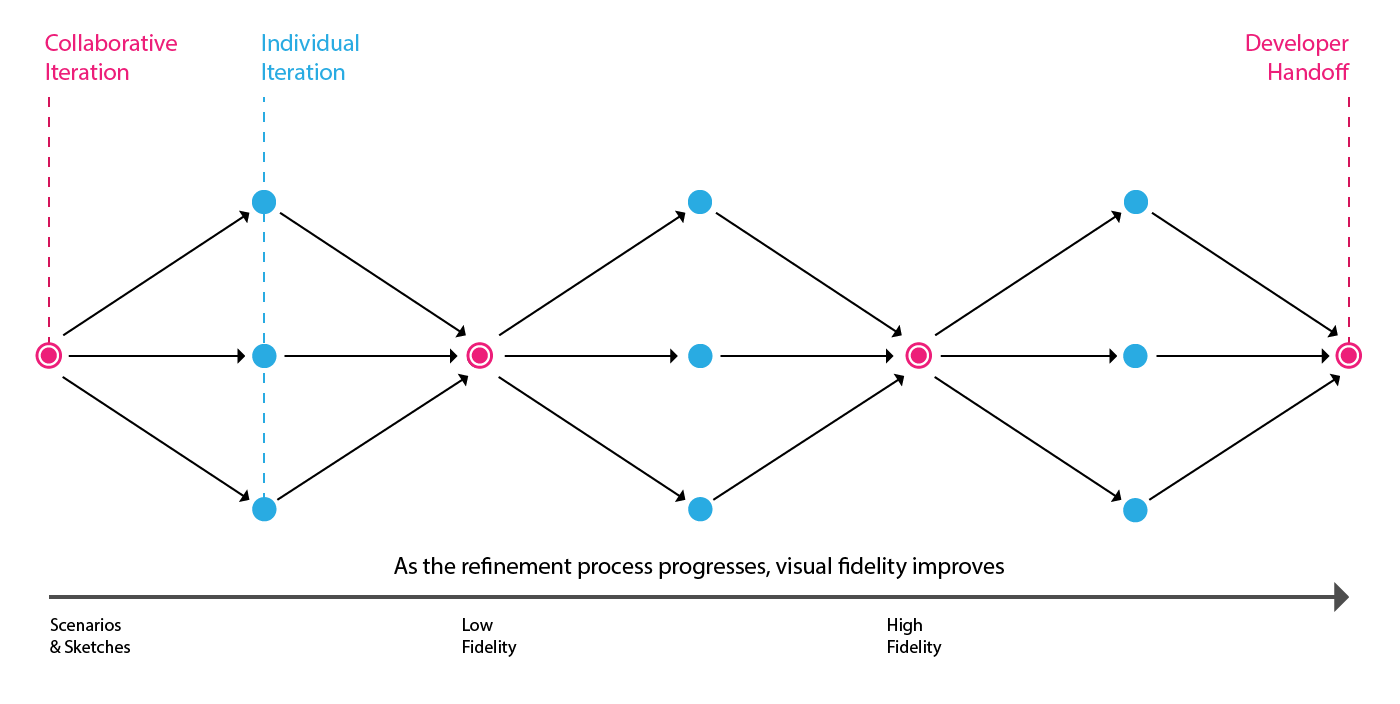
The process of iteration is starting with those high level ideas identified in the kickoff and working them into the right solutions over the course of the sprint. To do this, we tended to oscillate between individual, heads-down work on refining the designs into tangible options, and collaborative sessions to review those design options and gain consensus on what is working and what is not. A typical feature will move back and forth between those two states a number of times, starting from low fidelity wireframes and refining as time goes on and plenty more feedback and reviews refine it into the right solution.
Step 4: Prototype to tell the story
Once the designs start to become more tangible, usually around halfway through the process, I will always take those designs and turn them into prototypes that map against our user flows. This helps us to see the design not as a series of static screens, but as an interactive flow through a task. It is a wonderful tool for telling the whole story of the task that you are designing; starting from the entry point and seeing presenting each interaction as you move towards completing the task. More than that, however, it is also an important part of the handoff to developers, as well as being a quick way to walk our customers through a feature and get feedback before it is even built.
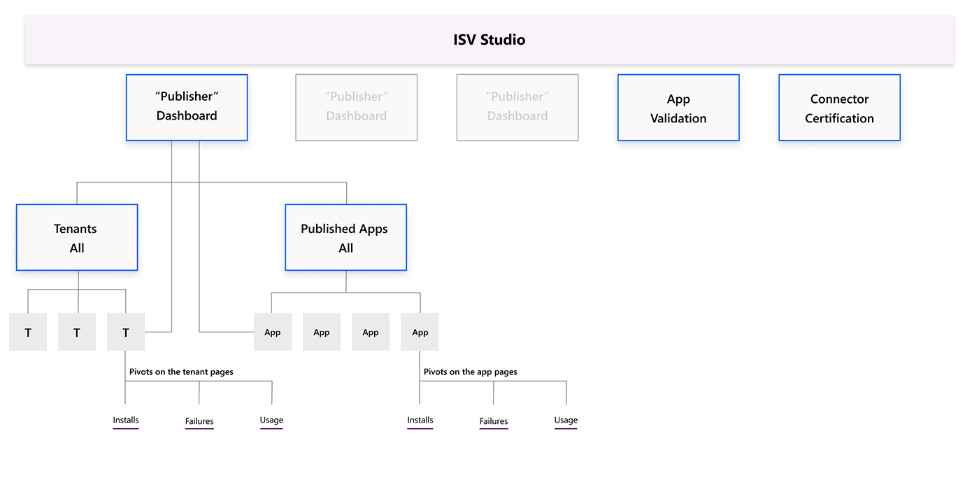
Using prototypes for each feature allowed us to answer the question: Does this fit naturally into our information architecture?
Step 5: Hand off and Follow Up
Engineers are a critical perspective in the process, and we always worked hard to make sure they were included early in the process and often. This means that when we got to handoff, they already had plenty of context on the feature and the work required to ship it. We handed off interactive redlines along with notes and the prototype, but my effort in shipping the design did not end there. I continued to loop in with the engineer to field any questions that would crop up in development, and I also participated in weekly bug bashes where we were able to make sure that the features were working in every edge case and that they were true to the vision set out in the design.
Methods of follow up after handoff:
Bug Bashes
Everyone gets together to test the core scenarios in the staging environment.
Office Hours
Dedicated time for engineers to ask design questions on what they are making.
Customer Interviews
Testing our new feature designs with real ISV customers for feedback.
Design Thinking: Working with Data
As ISV Studio was first and foremost about serving critical data to our customers, many of the design challenges that we encountered had to do with visualizing data.
These are some aspects of data vis that we had to consider when designing ISV Studio:
Functions of Data
Give quick, high level insights
One of the hallmark values of a data vis is the ability to get key insights into your data at a glance. Our customers are busy people, and we wanted to prioritize giving them high level details on the data that is most relevant for data. We prioritized info like total installs and any recent failures to be shown at the top level of the Studio IA, allowing them to get these insights the second they log in.
Functions of Data
Comparing and contrasting to learn
Whenever we were implementing a feature, an important question was what data sets our customer cared about in a given scenario, and how we can best structure the dashboard to compare and contrast those key values. For any given data vis, we also needed to consider what other visualizations would be complementary to it, so we could show them inline. Empowered with features like cross filtering, this allowed our customers to directly compare related data sets to understand the bigger picture.
Functions of Data
Data as a source of truth
Data visualizations must be trusted as sources of truth, and it is critical for those that will be designing them to be vigilant in making sure that everything is clear and truthfully labeled. With so many details to the data that we show, it can be a challenge to strike the right balance between clarity and complexity. We partnered with content designers to make sure that copy in the studio was abundantly truthful, and with data scientists to make sure that the underlying databases would not show misleading results.
Functions of Data
Start wide, but drill down to the details
We designed ISV Studio around "drilling down", the concept of staring with large data sets and then narrowing the scope down to the most relevant nitty gritty details. Our information architecture was designed around starting with high level info, and got more specific as you navigated deeper into the hierarchy. At some of the base pages, we supplied data tables with all of the details intact, allowing customers to filter down the data into a specific scope and export that info into CSVs to share internally.
Functions of Data
Start wide, but drill down to the details
We designed ISV Studio around "drilling down", the concept of staring with large data sets and then narrowing the scope down to the most relevant nitty gritty details. Our information architecture was designed around starting with high level info, and got more specific as you navigated deeper into the hierarchy. At some of the base pages, we supplied data tables with all of the details intact, allowing customers to filter down the data into a specific scope and export that info into CSVs to share internally.
Final Designs
Over the course of a year, we were able to develop the designs for the studio and document the development roadmap to come. Below are a few final designs for some of the features that were worked on; each of these represents multiple iterations of work, and were informed by input from the design studio, the engineering org, and our customers themselves.
Using the landing page to show the critical data first
Many of the scenarios our customers were in were centered around getting a few key pieces of data, so we wanted to put those front and center on the landing page so that they could get that info quickly and move on with their jobs to be done.
Creating a scalable overview of apps in the market
We looked to guidance from other dashboard experiences to put important data into the navigation of the site. Different apps are represented by a card that shows the installs and errors of that app, and provides entry points to get into the three dashboards.
Serving robust data on errors and failures
We knew from our customer pain points that unexpected failures in their apps were a huge issue for partners. We put many sprints worth of work into creating a detailed dashboard that not only notifies of these failures when they happen, but also diagnoses the issue so they can prevent it on future installs.
Giving partners advanced controls to analyze telemetry
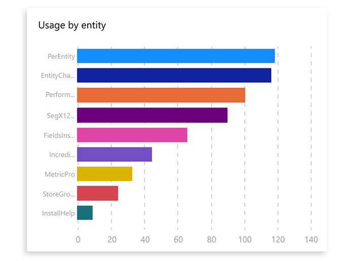
A huge part of growing these apps was in understanding the how and when it is being used, as well as looking at which aspects of your app are performing the strongest. We created a robust Usage section with powerful filtering controls, allowing partners to dive gain insights about even the most granular aspects of their apps.
Providing tools to lower the barriers to the market
While data is the primary purpose of the studio, we also were able to develop a few powerful tools for our partners to get their apps on the market much quicker. The App Validator was a success on two fronts; it cut down weeks of back and forth from manually validating apps by automating the whole process for our partners, and also helped Microsoft by reducing the resourcing required for the manual process.
The project in retrospect . . .
This was a very important opportunity for me to develop my skills as a product designer, and the results were wonderful. Though I had worked on sprint schedules before, this was by far the most agile environment I had worked in, and I was able to foster a good relationship with the PM and the engineers to make sure that we had design input in the entire process. It was a great opportunity to be the principal designer for this product, and I am proud of the work the team produced.