With T-Mobile making an exciting move into the cable industry, we were tasked with making an interactive retail demo to "wow" customers and demonstrate the value in the groundbreaking new service.
T-Mobile is a brand about disruption; focusing on making their way into tired and stale industries and shaking things up with incredible value and a focus on the customer. With the incredible success they have had making waves in the mobile sector, they have now made the bold new jump to offering live TV.
Our agency were experts in creating unique retail experiences for T-Mobile, so it is natural that we were tasked with crafting the interactive in store experiences that would introduce T-Vision, their exciting new television service, to the masses
The Team
UX Manager
Project Manager
Content Designer
Interaction Designer
Graphic Designer
Motion Designer
My Role
Interaction Designer
Determine how any interactive surfaces will function.
Determine the user flow and scenarios for the customer experience.
Accommodate for additional requirements in the process, like changes to strategy or new interactions.
Advocate to the client for the best customer experience.
Work with the brand experts to make sure that the final designs remain usable and to spec.
Collaborate with the project managers to present and validate concepts with T-Mobile stakeholders.
Key Insights
Gathered from discovery analysis and client discussion
Customer Needs
The demos will be displayed in a store, and thus should have a low barrier to interact with, as well as allowing for leaving at any time.
There are many potentially interesting features of T-Vision, and we want the customer to explore them at their own pace.
Locking an in-store customer into a long demo may cause most of them to lose interest or not engage in the first place; keep it simple.
Business Needs
Prioritize showing off about 6-10 flagship features of the T-Vision service that differentiate it in the market.
The demo will be shown at many standard retail locations, but will also be featured at their larger and more advanced "flagship" stores. We will need to accommodate for both.
We will need to accommodate for some admin controls, as well as a way to switch the demo language for non-native speakers.
Discovery
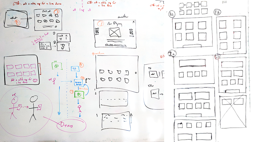
We took a very fundamental approach to the discovery phase of this project, starting with nothing but a whiteboard and the constraints we had gotten from the client. Starting from square one helps to view the project without any bias towards a specific strategy. This is important, as sometimes just going with the most obvious idea leaves a solution that may have worked better unexplored.
Whiteboarding is the essential design exercise of getting out as many ideas as possible within a group setting. These scribbles and squares may look hardly intelligible to some, but designers will see this as the language of collaboration. Usually, the least amount of fidelity that is required to get the point across is the quickest approach.
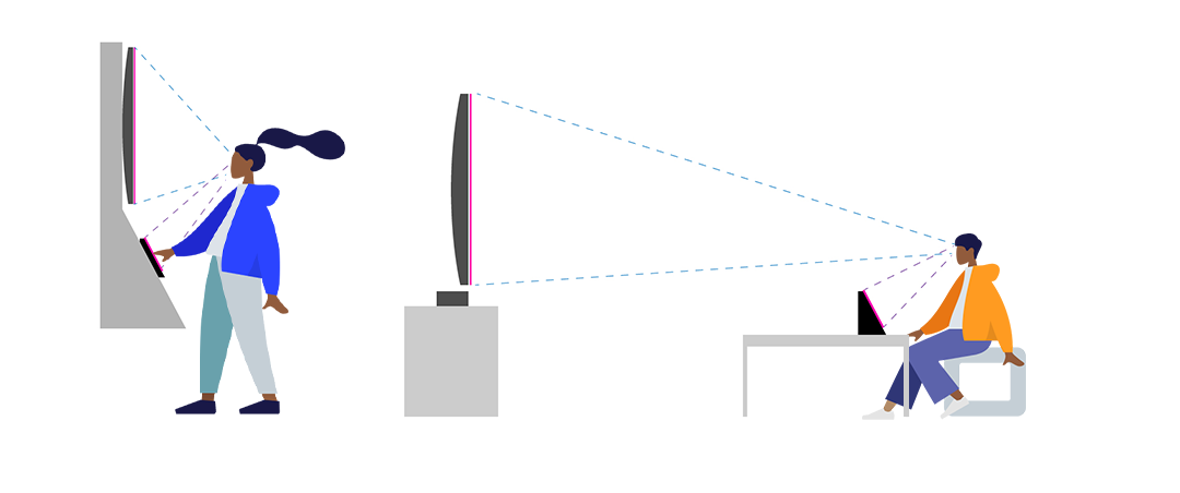
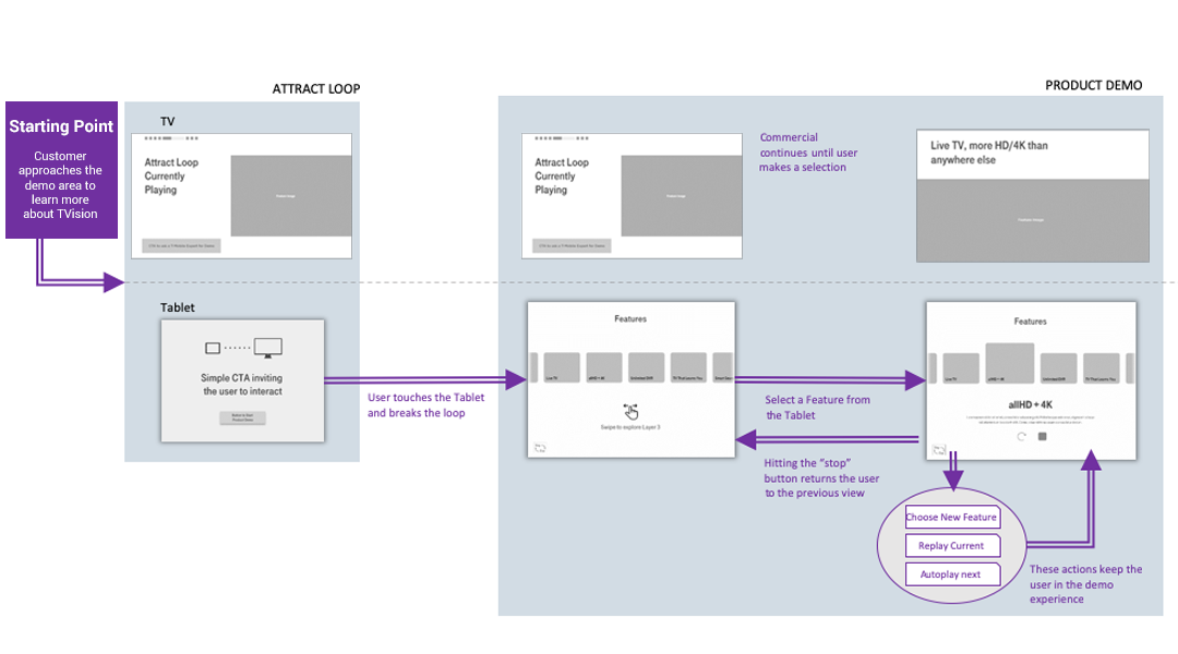
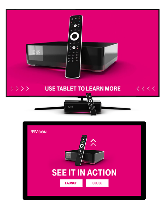
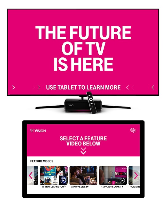
For in-store demos, it is critical that we understand the context and constraints of the physical space we are designing for. The above diagram was based off of our measurements for the two settings the demo will take place in, a larger sitting environment for flagship stores, and a more compact kiosk for standard stores. We used these models to understand how focus will be shifted between the two key surfaces, the tablet and the television.
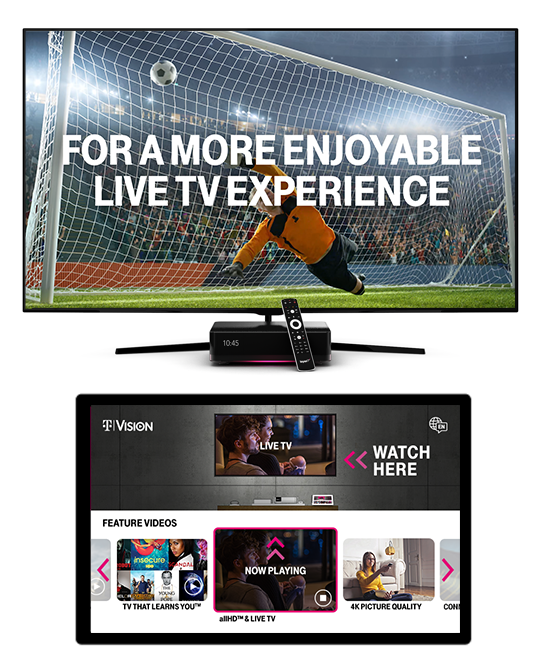
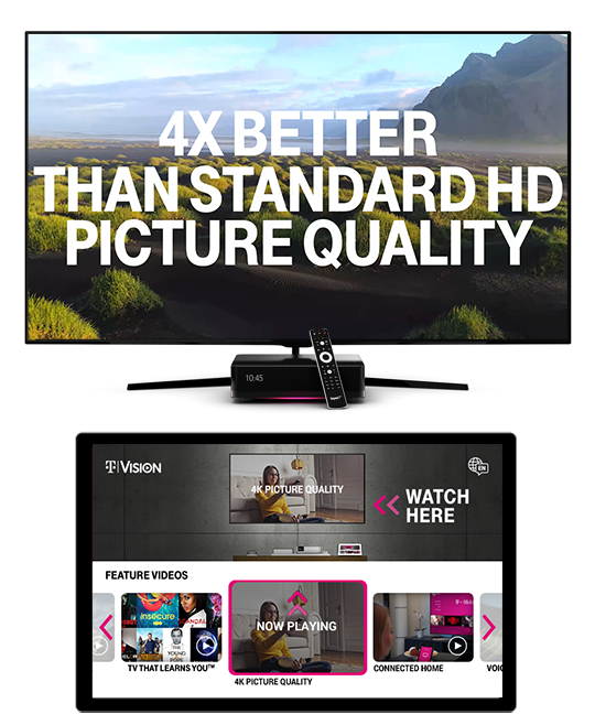
The purpose of the tablet interface is to allow the user to select from a range of flagship features that T-Vision has. It will then play an overview of that feature on the main television. Since the tablet was the main point of interaction, it was a huge part of my responsibility.
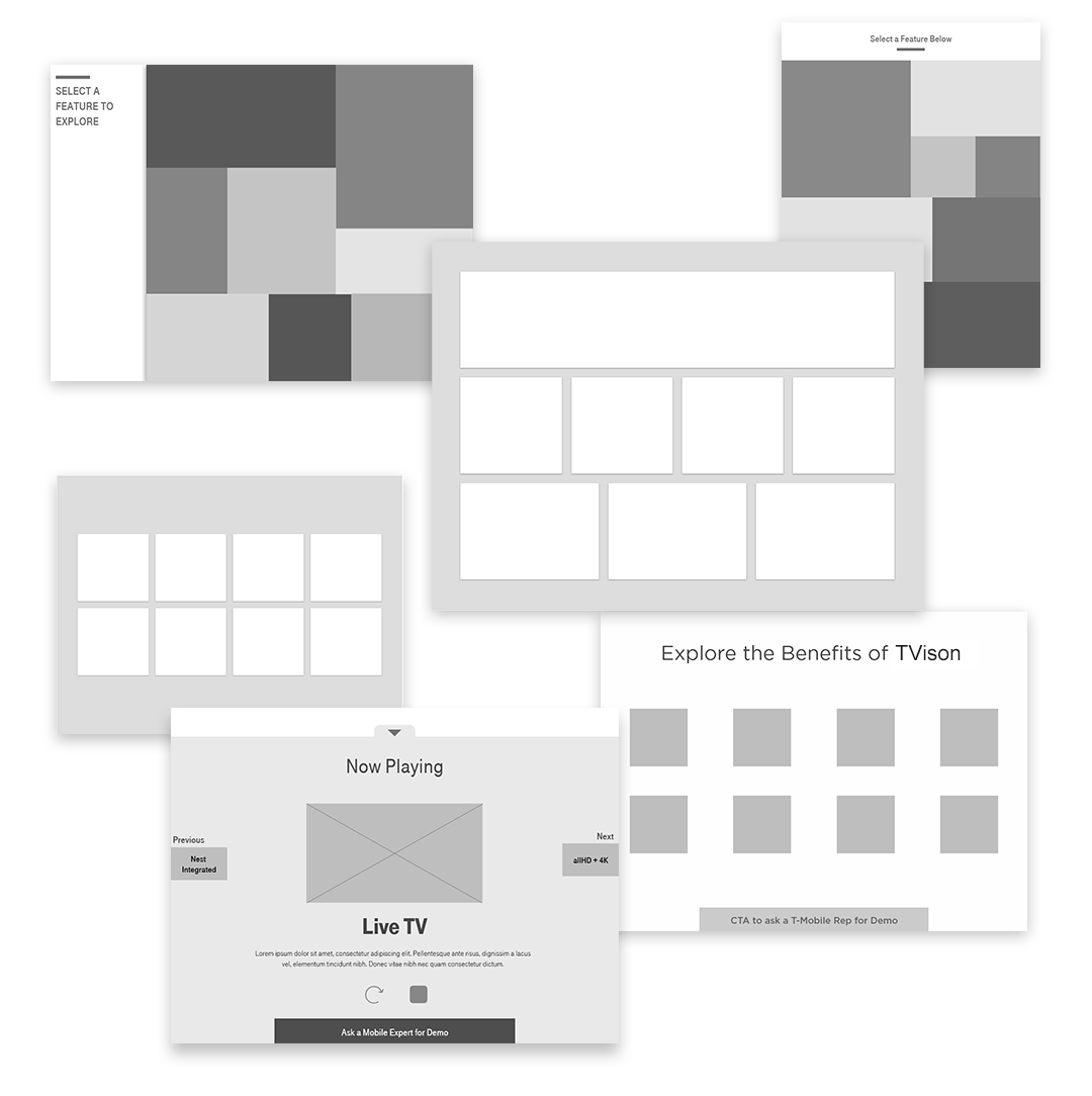
We compiled a huge range of concepts for the tablet interface and tested each with a prototype. This was to diagnose how we wanted the interface to look and feel, as well as what it needed to have. Having concepts to compare and contrast is critical to this.
But we ran into a problem.
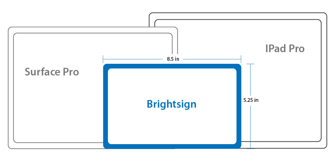
We found out that we would not be using a traditional tablet, but needed to use a BrightSign tablet meant for commercial display. It is 8.5 in by 5.25 in. This is smaller than most industry standard tablets, and meant that most of the content would get tightly squashed if we used a grid layout.
We looked back to find a solution.
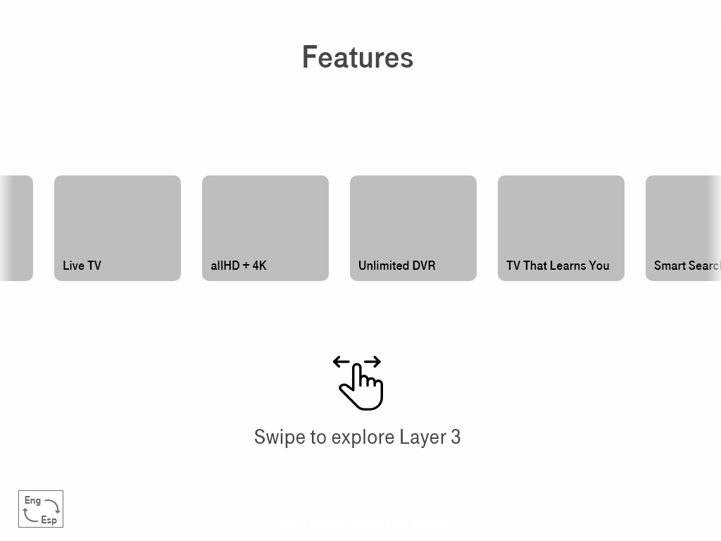
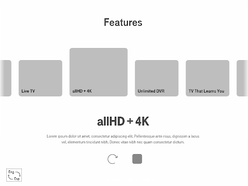
We went back to our concepts, and decided to use our carousel layout, allowing users to scroll through the options, but also give the current ones plenty of space.
Bringing it together
With the tablet interface mocked up, we iterated on our user flows so we could bring it together with the television commercials. This made it easier to discuss the experience as a whole, and was amazing for walking the clients through the details before we built it.
Realistically, this is where we spent the most iterations.
This is where a designer's role as an ambassador really picks up. Circling these comps around, gaining consensus, making adjustments, taking in new requirements or changes to copy; it can represent a lot of the work. To do a good job of socializing designs requires excellent presentation skills, critical thinking skills for working through evolving problems, flexibility and empathy for the other team members and their realities, and most importantly the ability to rationalize every choice you have made.
Next was to incorporate the brand.
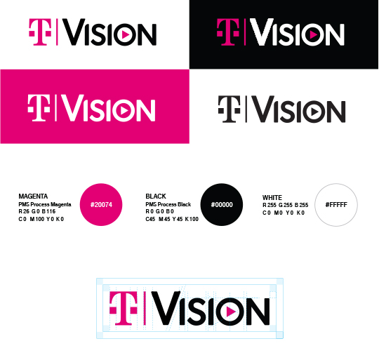
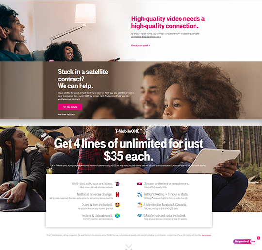
T-Mobile has a strong brand, utilizing punchy typography, strong photography elements, and of course their signature Magenta color. We were fortunate to have a T-Mobile brand experts working at Razorfish, and the final steps were collaborating with them on applying the brand to the interaction design. We compiled examples of T-Mobile brand in interactive settings, and used these to create a perfect branded interaction experience.
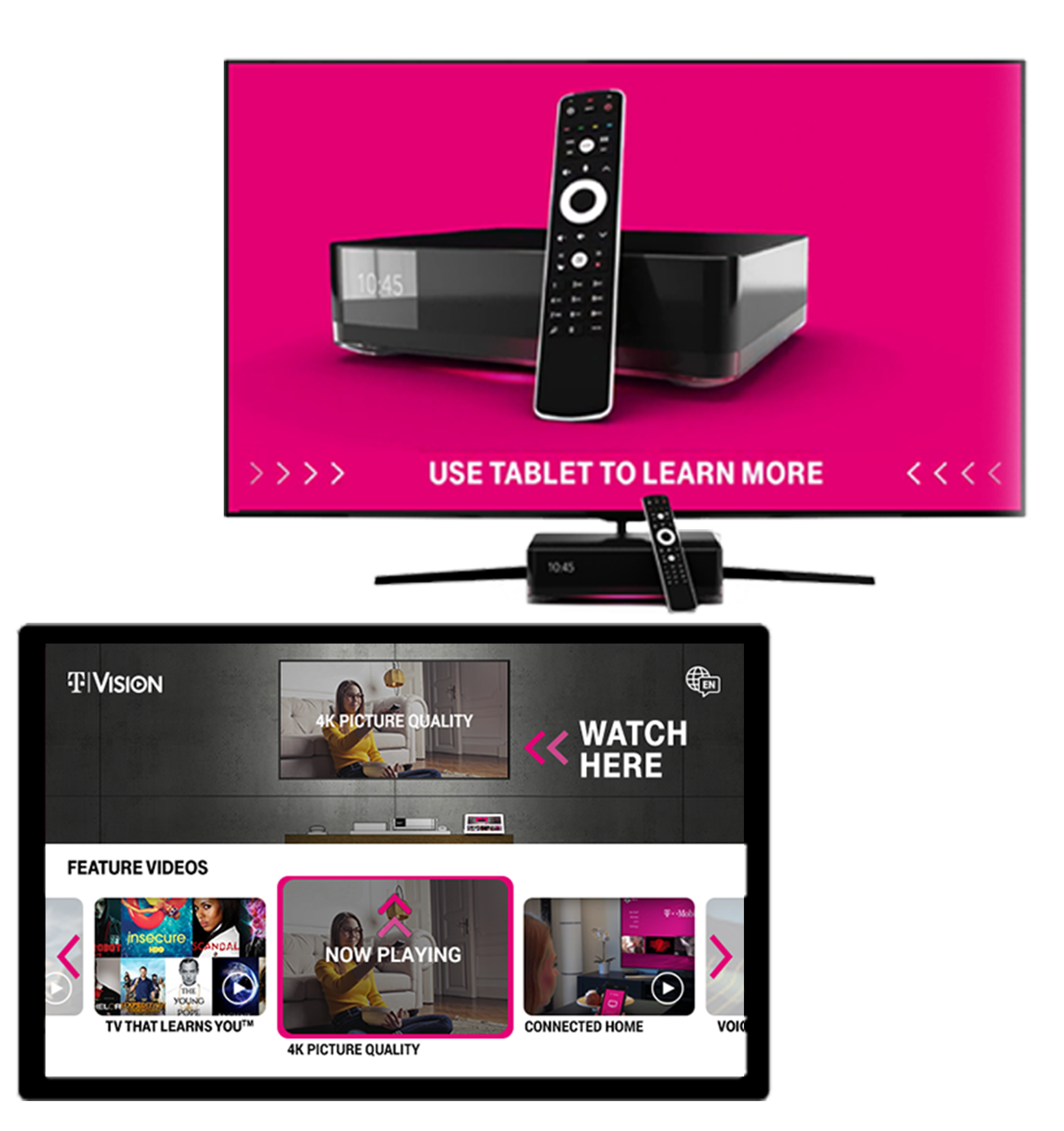
This tablet experience came together with the wonderful work done by the motion graphic team to spin up great TV spots for each of the flagship product features. This was accommodated with a "sizzle reel" for when the experience is idle, designed to draw eyes and bring people into the interactive demo.
Final Designs
After all of this cumulative effort, we were able to bring all of the elements together and make a unified pitch to the T-Mobile stakeholders. It was a resounding success, and the final designs were approved and shipped off to the engineers to be created. Below are a few comps to get an idea of the final vision for what is in stores today.